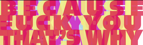
Fuck You That’s Why
Regular price£750.00 Sale pricePickup currently unavailable
Printed on Fine Art Hahnemühle Hemp Natural Line 290 g/m2.
Each print comes signed and numbered.
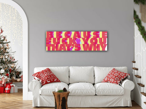
Unframed. Send in a tube.
Print size 130x40 cm
When Typography Screams and Colors Laugh
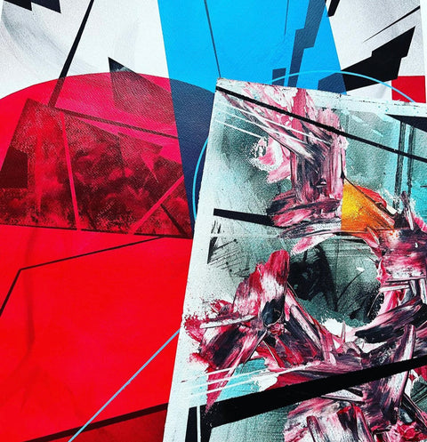
Some artworks whisper. Others murmur cryptic messages into our ears. And then there’s Fuck You That’s Why by Thomas Haensgen—a piece that stands right in front of you, locks eyes with you, and, without blinking, yells: “Why? Because I can.”
Haensgen takes the art of typography, hurls it against an explosion of color, and leaves us with the same feeling we get when, hours after a heated argument, we’re standing in the shower thinking, “That’s what I should have said!”—except this artwork has already done the talking for us.
Why This Work? Why So Loud?
Typography isn’t just lettering; it’s an attitude. It’s the eye contact you can’t avoid when passing a billboard. Haensgen takes this idea literally—or rather, word for word. The letters are monumental, blocky, yet paradoxically transparent, making them feel both overwhelming and weightless, aggressive and playful—like a visual drum battle between David Carson and Barbara Kruger.
And the color palette? An absurd laugh in pastel. Imagine taking the hues of a tropical cocktail, giving them a strong dose of LSD, and then forcing them to deliver a corporate PowerPoint presentation. This tension between playfulness and intensity, chaos and clarity, makes the work so compelling.
Context: When Design Dissolves Itself
Traditional poster design strives for clarity, but Haensgen does the opposite: He lets the letters blur, break, and merge—like language rebelling against itself. It echoes the fragmented typography of the Dadaists, who experimented with meaning in the 1920s. At the same time, it carries the spirit of punk-era design, where typography wasn’t just information but aggression—think Sex Pistols album covers, but dipped in Pop Art candy colors.
Yet, unlike the raw anarchy of early experimental typography, there’s an underlying order here. Haensgen plays with our visual expectations: We want to “properly” read the text, but the longer we stare, the more it dissolves into pure pattern. It’s as if the image, after an outburst of rage, has reclined into a state of ironic self-satisfaction.
The Uniqueness: A Visual Slap with a Lingering Aftertaste
The genius of Fuck You That’s Why isn’t just in its language or design—it’s in what it does to us. It provokes. It forces us to confront the raw beauty of directness. It’s the graphic equivalent of someone ending a philosophical debate by firing a confetti cannon.
This artwork yells at us—and the best part? It doesn’t expect an answer.
Artist Seller Policy
TESTIMONIALS
Don’t take our word for it - find out why artists and customers use SOTA below.